Fool's design, 2013-03-14 02:58 »
Fool's design.
Office 2013 - Scrollbars, the madness of a splitted mind.
Microsoft's design team has zero clue about the importance of clarity in in the visual cues. Visual cues must be very clear and well,
VISUAL, to take the burden off the eyes and the brain. After all, computers are here to help make our lives easier not harder.
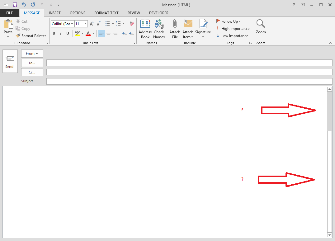
When 90% of your working space is white, the natural and logical assumption the eyes and the brain makes upon a quick glance is that the darker and smaller section is the scrollbar handle, but not so in Microsoft land! They will confuse your eyes and make your brain work for an extra 1-2 seconds each time you try to take a quick glance at those invisible scrollbars trying to find the handle.
What looks like a trivial non-issue at first, becomes a very large problem when using this tool several hours a day. The majority of the users will not even know why they are a little more tired at the end of a working day when using this tool. It is hard to identify. Small issues, taking away your time, energy and sanity one small piece at a time.

- Splitted_Mind_by_blutspender.jpg (199.63 KiB) Viewed 6958 times
- outlookcarrotwtf03.png (4.57 KiB) Viewed 6958 times
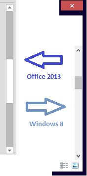
There is also the traces of a splitted mind visible all over the place. In Windows 8, the scrollbar handles are dark on light background versus Office 2013 where the scrollbar handles are light on dark background.
- outlookcarrotwtf02.png (27.83 KiB) Viewed 6958 times
- outlookcarrotwtf01.png (24.33 KiB) Viewed 6958 times
Fool's design.
[b]Office 2013 - Scrollbars, the madness of a splitted mind.[/b]
Microsoft's design team has zero clue about the importance of clarity in in the visual cues. Visual cues must be very clear and well, [u]VISUAL[/u], to take the burden off the eyes and the brain. After all, computers are here to help make our lives easier not harder.
When 90% of your working space is white, the natural and logical assumption the eyes and the brain makes upon a quick glance is that the darker and smaller section is the scrollbar handle, but not so in Microsoft land! They will confuse your eyes and make your brain work for an extra 1-2 seconds each time you try to take a quick glance at those invisible scrollbars trying to find the handle.
What looks like a trivial non-issue at first, becomes a very large problem when using this tool several hours a day. The majority of the users will not even know why they are a little more tired at the end of a working day when using this tool. It is hard to identify. Small issues, taking away your time, energy and sanity one small piece at a time.
[attachment=3]outlookcarrotwtf01.png[/attachment]
[attachment=2]outlookcarrotwtf02.png[/attachment]
There is also the traces of a splitted mind visible all over the place. In Windows 8, the scrollbar handles are dark on light background versus Office 2013 where the scrollbar handles are light on dark background.
[attachment=1]outlookcarrotwtf03.png[/attachment]
[attachment=0]Splitted_Mind_by_blutspender.jpg[/attachment]