Steven W, 2014-07-25 03:19 »
I've been using Windows 3.11 for over a week now, and I have to say there really is something to be said for the way the title bar is layed out:
[attachment=]titlebar.jpg[/attachment]
I like the way the maximize and minimize buttons are separated from the control menu button. In my opinion it's almost a shame that this was done away with. It's also not too difficult to see that the Program Manager, with a little refactoring, could have been kept instead of switching to Explorer. Imagine Program Manager with a programs menu, eliminating the 'program groups' in Windows 3.x. Also imagine a customizable toolbar, to set up shortcuts to your favorite progams and a clock shown on the toolbar. Add some of the right-click context menues (like explorer has). I rather imagine that in a parallel universe this is likely what Microsoft did.
- Attachments
-
- titlebar.jpg (102.31 KiB) Viewed 9221 times
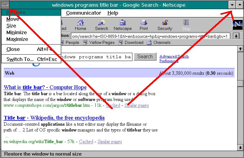
I've been using Windows 3.11 for over a week now, and I have to say there really is something to be said for the way the title bar is layed out:
[attachment=]titlebar.jpg[/attachment]
I like the way the maximize and minimize buttons are separated from the control menu button. In my opinion it's almost a shame that this was done away with. It's also not too difficult to see that the Program Manager, with a little refactoring, could have been kept instead of switching to Explorer. Imagine Program Manager with a programs menu, eliminating the 'program groups' in Windows 3.x. Also imagine a customizable toolbar, to set up shortcuts to your favorite progams and a clock shown on the toolbar. Add some of the right-click context menues (like explorer has). I rather imagine that in a parallel universe this is likely what Microsoft did.